Project I: Covid19 Data Visualization
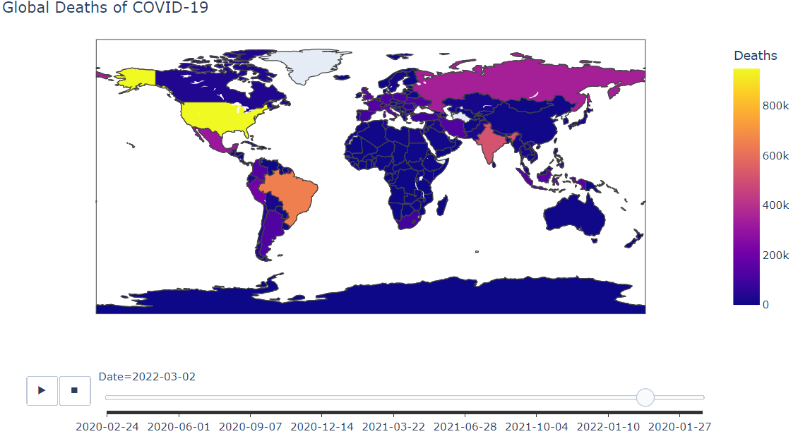
- Using Choropleth map to Visualize Global Spread of COVID-19 from first day of the pandemic
- Using a Bar chart to compare different countries in terms of How massive the Spread of the virus has been in there
- Visualizing the impact of the national lockdown in Italy on the spread of the virus
- Visualizing the impact of the national lockdown in Italy on the deaths rate